|
|
Edited by tifa_leo at 8-6-2017 04:19 PM
|
This post contains more resources
You have to Login for download or view attachment(s). No Account? Register
x
|
|
|
|
|
|
|
|
|
|
|
Edited by seribulan at 20-6-2017 01:23 PM
There’s an age-old saying that we should never judge a book by its cover. But having a good cover certainly helps, and having a poor one might unfortunately hinder the book’s success.
When you are designing a book cover you are visually representing the chapters, paragraphs, characters, events, settings, and ideas, all in a single image. It’s a pretty hefty job to take on.
But fear not, because you don’t have to be a technological whiz to create a striking cover design with Canva’s free online book cover maker. People will be judging your book covers for all the right reasons in no time.
So, let’s jump right in and have a look at some of the ins and outs of designing a beautiful and functional book cover.
Starting The Design ProcessLost at where to begin? I don’t blame you, book covers are bigger projects than they might initially seem. So, let’s start with the basics.
Read (and Understand) the ContentThis step will seem blatantly obvious to some people, and completely pointless to others, but reading and understanding the content you are designing for is a crucial part of a successful cover design.
Of course, that being said, sometimes life gets in the way. You can’t always get your hands on a manuscript, there’s not enough time for you to read a 400 page novel before the brief is due, etc. In these cases, my advice would simply be – do your best to understand the content.
Google synopses (if available), read reviews (again, if available), find out the themes, topics, characters, settings etc. that are at work in the novel. Collect as much information as you can so that you’re not going into the design blind (or worse, ignorant).
Identify the Key Ideas in the ContentNow that you’re familiar with your content, it’s time to pick it apart. Identify key motifs, symbols, ideas, characters, settings, etc. that can be visualised in some way.
Was the book surprisingly noir-like? Perhaps you could use a monochromatic, palette. Was there a recurring object or symbol that you could visualize?
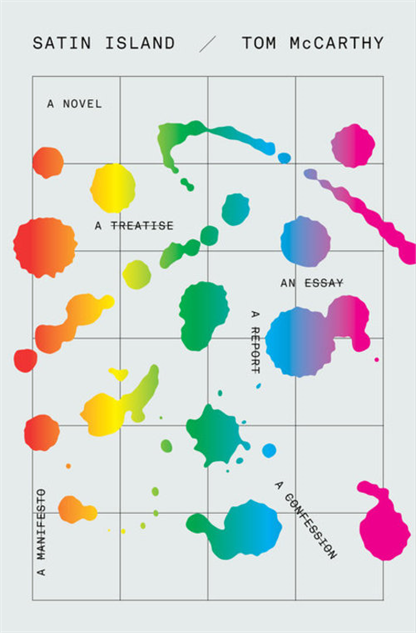
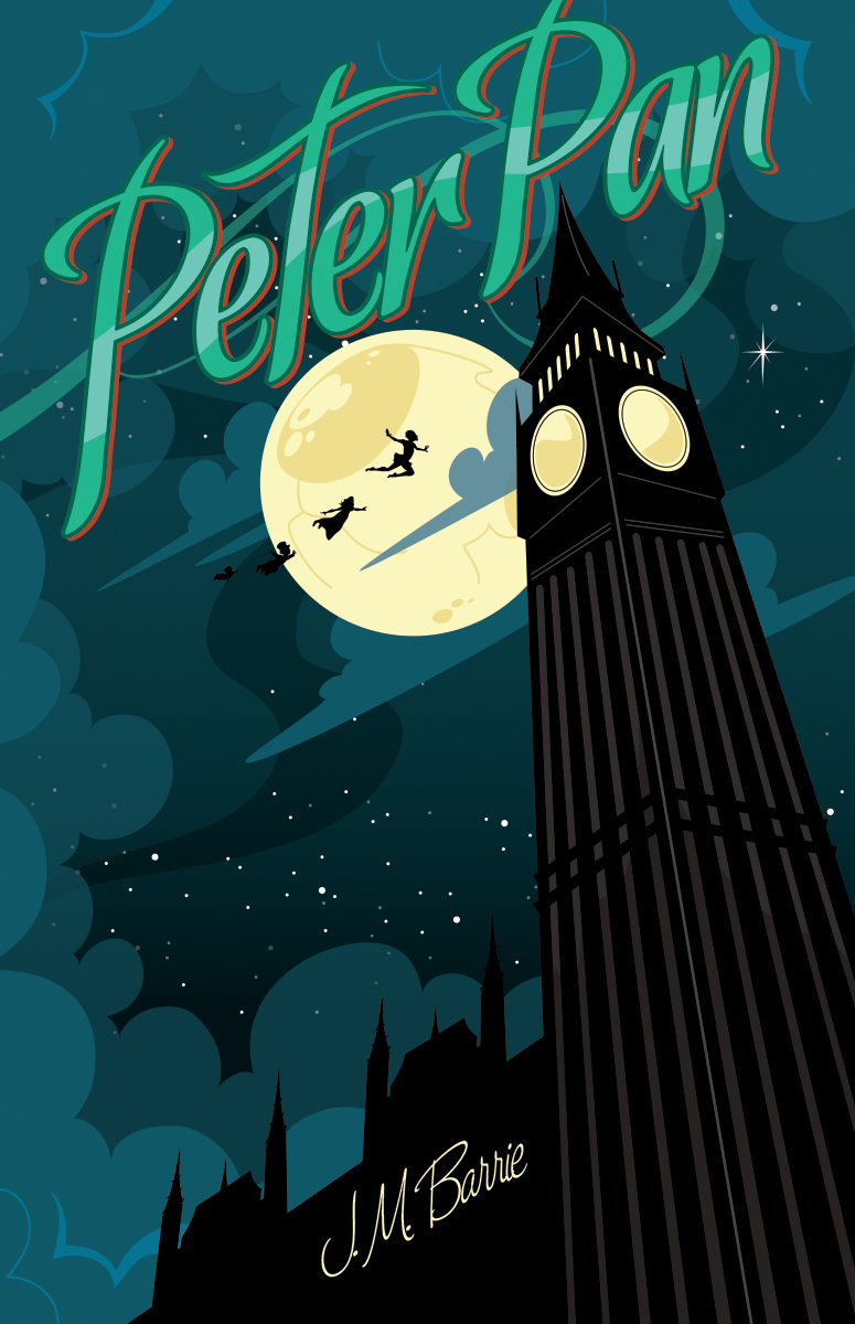
Let’s look at an example of a cover that does just this, using a story most of us are likely familiar with – Moby Dick.

 Umberto Scalabrini Umberto Scalabrini
This cover by Umberto Scalabrini captures the main theme of the novel’s plot – a man hunting for a white whale. Since the designer clearly approached the project with a knowledge of the content, he was able to create a stunning design that reflects the content in an elegant and effective way.
Show, Don’t Tell‘Show, don’t tell’ is a sage piece of advice usually reserved for writers that states an author should avoid too much exposition (‘He was feeling very nervous’), but instead should show through action, words, senses and feelings, (‘He wrung his hands together as beads of sweat dotted his brow’).
So, how can we apply this technique to design? Simple – try to avoid being too literal and too blatant in your design.
Depicting protagonists, antagonists, settings, faces, scenes, etc. was a common trope of old cover designs. Designers tended to illustrate or photograph the characters in action during a scene taken right from the book. For example, check out this sci-fi example for Alien Planet.

Alien Planet
Since then, design has shifted to a point where people (generally) prefer the simpler, more symbolic, less expositional approach to book cover designs. So, basically – less is often more. For example, here’s a cover design by Eric White for a current sci-fi bestseller.

Eric White
Note the difference between those two covers. The first is very expositional, showing an artist’s interpretation of the protagonists face, the setting, and the aliens, whereas the second cover subtly hints at certain elements of the story, character and setting.
Think of your cover design like a movie trailer. Sometimes you see a trailer and come away feeling like you’ve seen the entire film in two minutes because they’ve showed just about every major plot point. Other times, the trailers are a little more mysterious, they hint and give sneak peaks to the film’s contents, but you’re left wanting to see more.
Try to make your cover like the latter trailer, hint at elements of your story, but don’t give the whole game away just yet.
So, how do we do that?
Get SymbolicA great way to avoid being too literal and expositional with your design is to experiment with using symbols to represent a larger idea or concept.
Take this cover by David Drummond for example. As you may be able to tell from the title, this novel explores the emotional strain of a polygamist. What Drummond has done is used wedding rings as a symbol of marriage and polygamy, and the color red of the finger to signify stress and strain.

David Drummond
Similarly, this cover by Evan Gaffney uses a receipt and contrasting typography to represent the novel’s contents – an exploration into ‘The Selling of the American Wedding’. By contrasting the inky, digital, receipt-like type against the cursive and serif foiled wedding invitation-like type, this design captures the themes of the book in a subtle, symbolic way.

Evan Gaffney
Conveying Genre: Set the tone and mood for your bookThink about when you are in bookstore and you walk into the true crime novel section, what do the majority of book covers look like? Now, compare that to what the romance section covers. Chances are you’d see a huge shift in the use of color palettes, typography, and imagery, amongst other things.
Genre is so important to book cover design, particularly novels, as it gives consumers a signal of what to expect when they crack open that book, or have a skim of the blurb on the back.
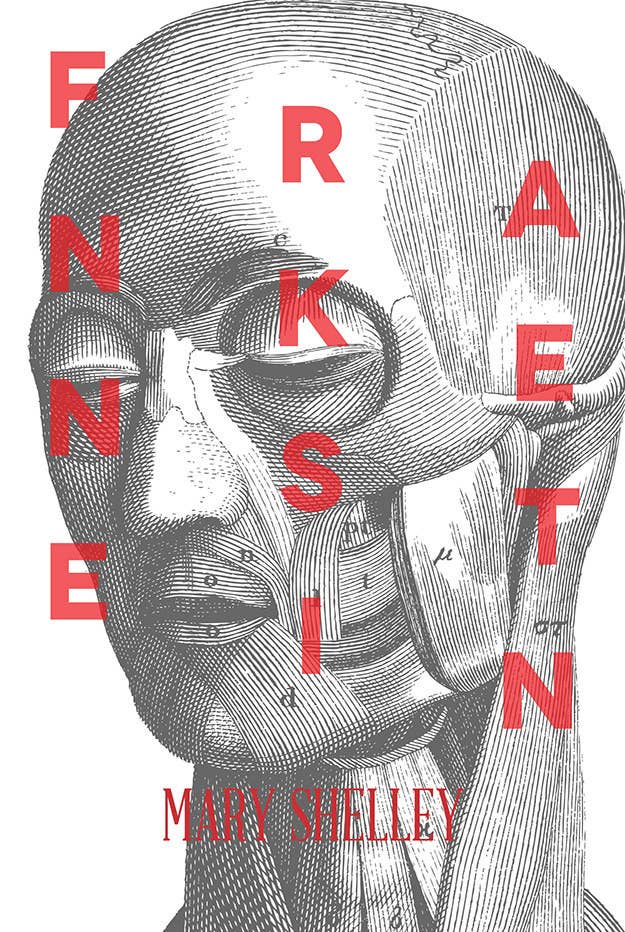
Let’s compare two covers from different genres and look at the differences between the two. First, we have a classic tale, Frankenstein, and this striking cover design for it is by Jessica Hische.

Jessica Hische
This novel is widely regarded as a gothic horror, as you might notice from the use of a dark reds and rich black palette, lightning bolt and castle illustrations, and the gothic typefaces.
Let’s compare this cover to a novel of a different genre altogether – Anne of Green Gables, a novel that falls under the genre of children’s literature. The following cover is beautifully illustrated by Anna Bond of Rifle Paper Co.

Anna Bond
This cover, unlike Frankenstein, uses light, feminine colors and gold foiling on the flowery and cursive type. It also uses illustrative elements, however (once again) unlike the previous example, this illustration is whimsical, friendly and significantly much less ominous.
So, while these two covers use type and illustration as their main design elements, by adjusting colors, finishes, style, and choice of type, each design is immediately signals the correct genre.
When designing your book cover, have a look at other designs in your genre – what palettes do they use? What kind of imagery do they have? What type style do they choose? Mix and match things you see with your own artistic flair to create a unique cover that also signals genre in a clear way.

Let’s talk type: Know the rulesIt probably goes without saying, but type is a pretty important thing, especially with book covers. Without type, your cover will have no title, no author, no publishing information, no blurb, no reviews, no nothing, and I really don’t recommend that approach.
There are a lot of ‘rules’ concerning type (here’s a list of 20 commonly broken ones), and of course, you’re always able to break, bend, or follow these rules as needed, but here’s a rundown on some common ones that might help you out while designing your book cover.
HierarchyTypographical hierarchy is the system you establish to organise your type and make it easier for your consumers to navigate. For a more in-depth look at hierarchy, check out this guide to mastering the three levels of typographic hierarchy.
This cover by Christopher Brian King uses typographical hierarchy in an interesting way. The cover is designed to look like a bureaucratic form, so there is a lot of type dispersed throughout the design, but the weight and size of the title, author name and subheadings indicates which parts of the design are most important.
Christopher Brian King
So, if you have a lot of type, or a lot of elements, be sure that your title, author name, and other important typographic bits and pieces are very quickly identifiable. To do this, experiment with scale, font weight, positioning and color until those elements really pop.
ContrastAdjusting the contrast of your type is another way to ensure that your type isn’t overwhelmed by the rest of your design, and manages to really stand out.
‘Contrast’ basically just refers to the degree of difference between two elements. So, you can have high contrast colors (black vs. white), but you can also have high contrast shapes (thick vs. thin, large vs. small).
This cover by Matt Dorfman uses a high-contrast color and scale to really let the type stand out in front of the black and white image.

Matt Dorfman
So, when you reach the typographical stage of designing cover, be sure to boost the color and size contrast of your type to keep your type just as legible as it is good looking.
Designing photographic covers: Tips and techniquesPhotographs are a great building block to have at your disposal. You can alter, adjust and combine them to create a whole bunch of different designs, solutions and effects.
So, if you’ve been supplied with a photo, are interested in using one for your design, or just want to explore your options, let’s have a look at some covers that use photographs in interesting ways.
Work with the Shapes and Colors of Your ImageThis example by Brian Chojnowski runs type along a slight diagonal line that mimics the incline of the image. This helps combine the type and image in a more natural way. The type is also colored to match the darkest tones of the image to keep things cohesive and natural.
Don’t fight against your image, work with it and use type to complement and enhance it.

Brian Chojnowski
Experiment with Effects to Create MeaningIs there a way to enhance your photograph’s meaning in relation to the book you’re designing for? This example by Jarrod Taylor runs a blur effect over the photograph and places type over key points of the face to reinforce the notion of ‘disguise’.
With careful and intentional adjustments to the colors, effects and textures of your image, you’re given hundreds of ways to evoke even more of the content’s themes.

Jarrod Taylor
Choose An Image You Can Work WithWhen choosing an image, take into account the rest of your design and the other elements you will need to add in. A good cover image can be just about anything – complicated, minimal, or anywhere in between, but just be sure to keep your entire design in mind when hunting for or taking your photos.
After all, there’s no point in having an awesome photo under your belt if you can’t find a way to pair it with an equally as fantastic design.
This cover by Megan McLaughlin uses a busy photo that has a lot going on, but that has allotted empty spaces for the type to sit nicely and legibly.

Megan McLaughlin
Designing typographic covers: Tips and techniquesDon’t have a photo to use, or perhaps you’re just not that interested in the photographic route? In either case, there’s plenty of different ways for you to approach your cover design, and one of those approaches is typographically.
So, let’s have a look at a few ways you can use and tweak your type to create a cover for your book that is just as equally as striking as any photographic cover.
Build up Your TypefacesThis cover by From Cover to Cover takes a simple sans-serif typeface and elongates and emphasises the lines of certain letters to create a super simple but effective design that also happens to reinforce the title’s concept.
Play with the shapes and lines of your type to create interesting effects and make your type the main focal point of your design.
From Cover to Cover
Contrast Analogue and DigitalCan’t decide between a digital typeface or a handcrafted on? Well, why not both?
Just like this example by Peter Mendelsund does, by contrasting digital and ‘analogue’ typefaces, you can create a really striking effect. Plus, in this case, this method once again reflects the book’s content and title by mixing a youthful and playful analogue typeface with a more traditional and clean digital one.

Peter Mendelsund
Overlay An ImageDo you want a typographically dominant cover, but are you also hankering to use some photographs and images? Once again, you can have the best of both worlds by overlaying an image or texture over your type to create a simple and quick but engaging effect.
This cover for Mamita does just that. The bold, scaled-up letters create perfect frames for each image/texture to peek out of. Not only does this add a cool effect to the design, it’s also a nice and subtle way to introduce color and character.

Mamita
Creating visual harmony: Balancing Type and ImageEverything should be intentional – your placement of objects, your knowing when to use.

Jim Stoddart
This cover by Jim Stoddart uses a fairly textured and busy image, so it keeps the type super simple to make it stand out and not have to compete too much against the photograph. It also keeps the typeface coloring a simple white to ensure the contrast is kept high enough to keep things legible.
So, if you’re using a highly textured image, consider keeping your type simple, high-contrast, and bold to maintain that balance between the two.
Now, let’s look at an example that has a less complex image and a little more room to play with type.

Oliver Munday
This cover by Oliver Munday has a reasonably simple and clean image, and yet it is still brightly colored and striking. So, when it comes to the type, Munday has balanced the image out with equally as simple but attractive type to keep the balance between type and image.
Note how there is a stronger use of hierarchy than the previous example, and the positioning of certain elements (i.e. the author name) has been adjusted to suit the image. And yet, once again, no one element is competing for attention against the other.
This next cover is an example of how to balance type and image when you have a whole lot of type.

Ervin Serrano
Sometimes you’ll be faced with a long, gruelling title and subtitle and wonder ‘how will I fit this all into a stylish design’? Well, in those times of trouble, take a leaf from designer Ervin Serrano’s book.
This cover has a long title and a lot of type, so the image has been toned back. By keeping only one graphic element and just a touch of texture, this design manages to balance the whole block of type with a little image.
Check out this example as well, this time designed by Jessica Hische. This piece uses very similar methods as the last to balance type and image, but it uses color as a main graphic element.

Jessica Hische
Overall, try to think of balancing your type and image as a give and take relationship. Have a lot of type? Cut down on the image a bit. Are you using a very busy image? Keep your type sweet and simple.
Designing A Series Of CoversSomething you may encounter during your journeys as a book cover designer is designing a set of books. Sometimes the books are a part of a narratorial series (think Harry Potter), and sometimes they are a part of a collection (think Penguin Classics).
Use Similar Design ElementsThis means a consistent use of imagery, style, type, and/or layout. There should be something to tie all of your cover designs together, this can be a common color, a common typographical style, a common illustration/photography style. The aim of this game is to differentiate make each cover unique, but to also make each cover cohesive with the rest.
These stunning covers by Carson Ellis for a narratorial series ‘Wildwood’ use a lot of similar elements over the three designs – similar type, palette, illustrative style and layout framework. However, each cover is engaging in its own right, too.

Carson Ellis
Have a Flexible DesignIf you’re approaching your first book cover design with knowledge that there will be other covers in the series, be sure that you keep your design flexible enough to suit each title.
An easy and effective way to do this is to keep your layout and design on the simpler side. The simpler your design is, the more transferrable it will be from cover to cover.
For example, check out this collection of book covers by Christina Bull. Each cover is very simple in its layout and execution, which makes it very easy to transfer the design onto a number of other covers.

Christina Bull
Sequels, prequels, collections and series are just becoming increasingly popular, so it’s always a good idea to keep these techniques in mind for the future to ensure your design packs a punch alone and in a group.
|
|
|
|
|
|
|
|
|
|
|
|
I minat buku lama2 yg jenis hard cover.. terasa wow kalo dpt pegang buku tu.. mcm dpt pegang precious gems
|
|
|
|
|
|
|
|
|
|
|
|
|
Classic books yg i baca time sekolah |
This post contains more resources
You have to Login for download or view attachment(s). No Account? Register
x
Rate
-
1
View Rating Log
-
|
|
|
|
|
|
|
|
|
|
|
1. Title: Columbine
Author: Dave Cullen
Artist: Henry Sene Yee
Cullen's seminal non-fiction book - the definitive text about the Columbine High School Massacres of 1999 - deserves an iconic cover, and Henry Sene Yee provided it, with this minimalist design, incorporating a simple shot of the normal-looking school with a faintly ominous grey sky above it.

2. Title: The Craftsman
Author: Richard Sennett
Artist: Coralie Bickford-Smith
Perfectly suiting a book dwelling on the use of simple tools to create great things, Bickford-Smith uses of a random stack of pencils to create an incredibly cool cover. Cooler still, the artist ended up making use of them after the cover shot: "I use them to highlight my lists, so I don't forget what I'm doing. It's hardly artistic."

3. Title: The Road
Author: Cormac McCarthy
Artist: Nick Lowndes
Lowndes brings his unique stick-figure style to the fore on this cover for McCarthy's The Road, with the post-apocalyptic landscape perfectly represented by the bare, skeletal trees.

4. Title: The Humbling
Author: Philip Roth
Artist: Milton Glaser
This deceptively simple but clever cover perfectly represents the story within - the tale of an ageing actor who loses his power. The melancholy black and white theme together with the lonely spotlight makes for an extremely cool image.

5. Title: Zoo City
Author: Lauren Beukes
Artist: Joey Hi-Fi
Awarded the 2010 BSFA Award for best artwork, Joey Hi-Fi's artwork has become almost as famous as the book. What, at first glance, is just typography turns out to be an incredibly detailed drawing of animals, people and buildings - together, but also tearing themselves apart. Joey has done some consistently brilliant work throughout his career, and we think the BSFA got this one very right.
 |
Rate
-
1
View Rating Log
-
|
|
|
|
|
|
|
|
|
|
|
1. Summer and Bird, by Katherine Catmull
2. The Diviners, by Libba Bray
3. Crewel, by Jennifer Albin
4. The Forsaken, by Lisa Stasse
5. Cinder, by Marissa Meyer
|
This post contains more resources
You have to Login for download or view attachment(s). No Account? Register
x
Rate
-
1
View Rating Log
-
|
|
|
|
|
|
|
|
|
| |
Category: Belia & Informasi
|


 Post time 7-6-2017 07:13 PM


 Author
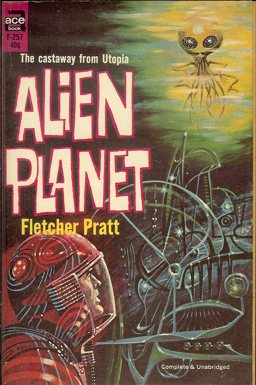 Alien Planet