|
Samsung presented the Galaxy S5 and with it, fulfilled expectations talked about for weeks on end. The new flagship by the manufacturer comes with a fingerprint scanner, an improved camera and to top it all off, a watertight chassis. A real surprise was the pulse sensor and the new user interface which is strongly reminiscent of the Flat Design from iOS 7. 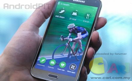 The interface: the illusion of haptic is missing (or is it?) In June 2013, Apple presented iOS 7 and broke all traditions set since the creation of the first iPhone. The smartphone pioneer bid farewell from the plastic 3D look worn by its contrast-rich and almost tangible interface. Instead they ventured into a new abstract and two-dimensional realm with little illusion of haptic. Android users know this as Flat Design, already being accustomed to it for quite some time now, especially with Google apps. And now Samsung is doing the same with the Galaxy S5. 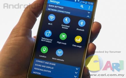 What one needs to say about this though is that Samsung, by doing so, falls short from offering a unified user interface. The new software, which without a doubt turned out exceptionally and belongs to one of the best that I’ve seen in Android, only appears in certain areas of the phone: the status bar, the Samsung apps and the settings menu. However, when switching from home screens or scrolling through the app drawer, you will soon enough see the bright and playful Android world from Samsung, which doesn’t seem to fit in with the new cool and clear atmosphere set up by the flat symbols and fine print. 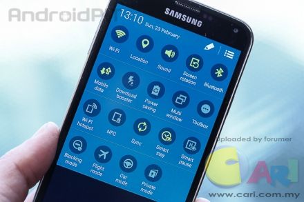 On the technical side, everything is as it should be, the system is fast, smooth and without a trace of a stutter. The design on the other hand seems unfinished. Though the direction seems right, the new version of TouchWiz on the S5 seems like a big construction site. The Android operating system in this case isn’t completely innocent here either, as it’s so open and offers a huge optic spectrum which is hard to control, like with app icons for example. Samsung will never be able to completely master the entire look - closed systems sometimes have their advantages. 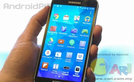 It’s about time we gave up expecting surprising design changes from Samsung, especially with its flagships. This is too much of a risk that could quickly lead to disaster, it’s better to stick with what the client knows. Apple has been doing this for years. Design: everything as usual, but now watertight 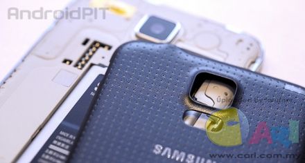 The device is slightly bigger than the S4, which is a bit of mystery, because the display is only 0.1 inches bigger. The display frame is a little bit thicker, but that shouldn’t be the reason. Samsung’s decision to place a matted plastic on the back and to make the entire chassis waterproof, resistant even when dunked into water, and this could be a cause. The disadvantage to the robust build means that it feels quite heavy in hand since the device isn’t just bigger than the predecessor, but also quite a bit heavier, at 145 grams instead of 130. Display: no suprises Even the display brings no surprises. Samsung decided on AMOLED again: it’s easy to see that the Korean company has mastered this technology just by looking at the display: intense colors and sharp contrasts would make any client a happy camper. That being said, I can say quite bluntly that I did not see any improvement compared to the S4. 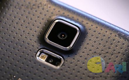 The camera highlight In my opinion the camera on a smartphone is often underestimated. This isn’t just a nice feature but also a reason from many to buy the phone and, in the decade of cheap but performing phones like the Moto G, a way to set itself apart as something high-end. Or better yet said, the premium manufacturer is able to win quite a few points and yes, Samsung has been able to collect quite a few. I couldn’t really take any test pictures in the short time I had, but without taking any, it’s clear that this is one of the flagship’s strongest points. It starts off with the Auto-focus, which is extremely sharp (according to Samsung, 0.3 seconds and faster than any other phone) and ends with the real-time HDR, which Samsung celebrated during its world premiere. HDR mode can be switched on in preview mode and directly observed just like you see in the picture. This is quite impressive. There’s also a bunch of other camera modes and settings options for a complete package. 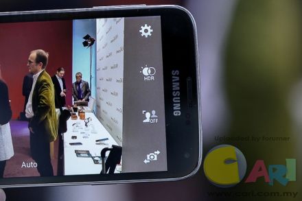 Fingerprint scanner: is it needed? Apple made it ready for mass distribution, HTC copied it and now Samsung is ready to offer the fingerprint sensor to the masses. Just like the iPhone, the Home button has integrated the feature and you swipe your finger over it to unlock the phone. The construction behind the feature allows one to unlock the phone with just two finger movements: the first tap to activate the sensor and then you just need to swipe your finger over top again. Samsung offers a solution which works exactly as intuitively as the one with Apple. In the test, the unlocking method worked quickly and uncomplicated and in my eyes, this is finally a real alternative to the pattern and PIN. The sensor can do more: there’s a so-called ‘’Secure Mode’’ to protect apps and documents via fingerprint. What’s more, PayPal is also supported allowing you to authenticate payments with the touch of your finger. Tech Specs and extras The heart rate scanner placed on the S5 next to the LED is used by simply placing your finger over top. The data will be collected in the S Health app and applied to your Personal Fitness Tracker. This is a nice function with the topic of fitness and health becoming more and more a part of mobile technology. The S5 is guaranteed not to be the only smartphone that will have this feature. 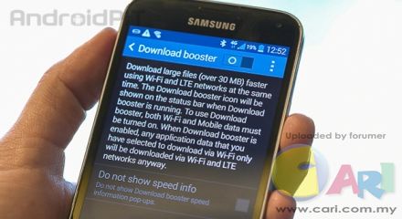 I don’t want to get any further into the technical details, but lets leave it at this: Samsung put everything into the device, a USB 3.0 port, the newest Qualcomm processor and a full range of connectivity standards such as the oldie but goodie IrDA sensor. 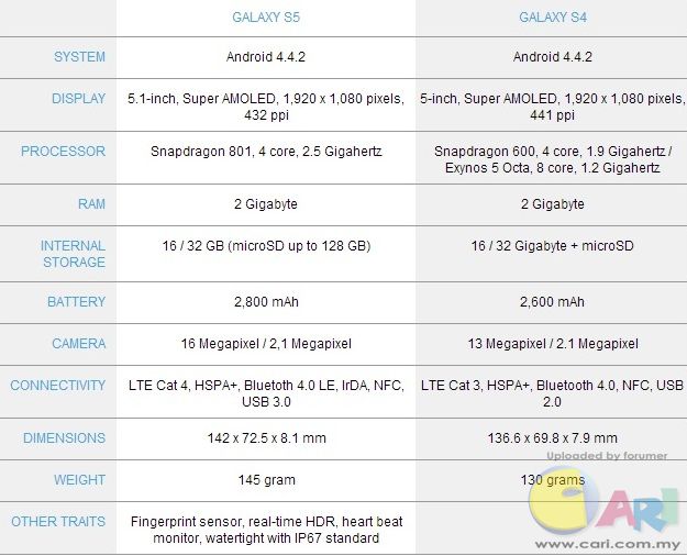 Source
|
ADVERTISEMENT