CariDotMy

 Forgot password?
 Register

ADVERTISEMENT

Author: 0001

Kongsi Gambar2 Artwork Korang Version 2

 Close [Copy link]
Post time 29-7-2008 10:11 AM | Show all posts
Originally posted by JAY-Z at 28-7-2008 11:20 PM
suka dgn artwork sinister...background colourful tu susah jugak nak buat kan


Tak jugak.. run je script dia, lepas tu mask out apa yg tak nak sgt colourful
Reply

Use magic Report


ADVERTISEMENT


 Author| Post time 29-7-2008 07:30 PM | Show all posts
Sorry... aku busy sket lately... nanti aku comment2 sket later.
Reply

Use magic Report

 Author| Post time 29-7-2008 08:03 PM | Show all posts
Originally posted by dang_anum at 28-7-2008 08:40 AM
http://img95.imageshack.us/img95/5808/akhw7.png

sedih tgk part rambut.....sampai skrg tak reti2 nak wat

Cuba cara ni...

1. Mula2 buang edges kat badan dia macam biasa until tinggal part rambut2 dia tu.
2. Now enlarge image tu and gi ke edge rambut dia. Pilih POLYGONAL LASSO TOOL.
3. Now select utk buang. Click-click as accurately as you can kat edges rambut dia... biar termasuk sket pun takpe. Buat ni section by section.
4. Untuk each section, bila dah complete, gi kat menu... SELECT > FEATHER
5. Setkan FEATHER RADIUS tu ke 1 (kalau image tu 72 DPI) atau 2-3 (kalau 300 DPI).
6. Tekan BACKSPACE key utk delete buang. Deselect.
7. Repeat steps atas tu sampai habis semua dah buang.

Cara atas tu ko akan notice edges dia akan lebih kemas and accurate.

Also boleh juga guna ERASER TOOL... guna brush size yg ada small feather radius.
Reply

Use magic Report

 Author| Post time 29-7-2008 08:04 PM | Show all posts
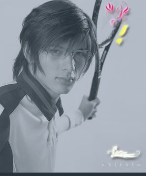
Originally posted by nanie2312 at 28-7-2008 07:43 PM
http://i153.photobucket.com/albums/s234/jual_beli/hane.jpg

ni ekad tuk my fren.....ni lah hasilnya...kiter msih belajar..ilmu pun blum tnggi mana pun........


mod nomboq.....kau lah sumber ...

Ilmu tu bukan kita yg empunya... so kenalah share2 sesama...
Reply

Use magic Report

 Author| Post time 29-7-2008 08:10 PM | Show all posts

Balas #341 oobi\ catat

Nice!

Perhaps kalau ko do something utk bagi nampak text 'rocklin' lagi clearly it'll be better... maybe the curvy-wurvy thingy kat blakang tu ko guna opposite gradient flow (eg yellow to pink from left to right)... or bagi ada colored outline to the text.
Reply

Use magic Report

Post time 29-7-2008 10:10 PM | Show all posts
mod...nak tumpang tanye..
macam brushes yg di d/l kite letak kat preset...

kalo kite d/l layer style kan.kite nak letak dia kat mane yek...
Reply

Use magic Report

Follow Us
Post time 30-7-2008 08:10 AM | Show all posts
ni my artwork...sempena kempen boikot barang israel

mod..ok tk? dr segi kekemasan sume..sy pakai bantai je wat...

Reply

Use magic Report

 Author| Post time 30-7-2008 10:24 AM | Show all posts
Originally posted by cinta_ungu at 29-7-2008 10:10 PM
mod...nak tumpang tanye..
macam brushes yg di d/l kite letak kat preset...
kalo kite d/l layer style kan.kite nak letak dia kat mane yek...

Tu letak dalam folder STYLES:

C:\Program Files\Adobe\Adobe Photoshop X\Presets\Styles

Reply

Use magic Report


ADVERTISEMENT


 Author| Post time 30-7-2008 10:53 AM | Show all posts
Originally posted by dauf87 at 30-7-2008 08:10 AM
ni my artwork...sempena kempen boikot barang israel

mod..ok tk? dr segi kekemasan sume..sy pakai bantai je wat...

http://www1.mediafire.com/imgbnc.php/422fd6fce85f22357d0be3abf5bc ...

Layout ni oklah... takde masalah sangat... images semua ok... text tu letak kat atas, tengah and bawah tu ok... mungkin text tu best kalau center-aligned.

Kalau ko nak buat poster utk ni... aku juga suggest ko ada satu perkataan (atau 2-3 tapi pendek) utk tangkap mata orang... sebagai contoh perkataan "FIKIR". Letak tu besar kat atas sekali... kasi ada space keliling dia... once dah tangkap mata orang, sure dia akan baca habis semua yg ko nak tulis tu.

Reply

Use magic Report

Post time 30-7-2008 12:46 PM | Show all posts

Reply #350 0001's post

thanks thanks!!!...idea yg best..nnt i try wat n letak kat cni..

thanks a lot mod..
Reply

Use magic Report

 Author| Post time 31-7-2008 06:56 PM | Show all posts
Ni satu web banner aku buatkan as dorongan utk seorang forumer sini naik syok nak blajar Photoshop:


Ni aku buat ikut consep forumer tu jugak... and 'effects' yg aku guna utk buat image ni semua basic2 jer.

Background tu ada filter noise sikit (value=3), pastu aku tambah gradient fill utk gelapkan bahagian bawah bg tu... nak kasi 'isi' sket dari dia leper jer. Nak kasi bg tu ada umph lagi, aku guna pen tool utk buat shape 'highlight' tu... convert path tersebut ke selection... then gradient fill ngan white to transparent dari bawah - jadikan bg tu cam berkilat macam ada light reflection.

Pastu aku letak brushes dedaun tu... tukar transparency and bagi shadow sket.

Text tu basic jer (Adobe Garamond Pro) yg di shadowkan sket. Text itam tu cam ada reflection aku guna gradient fill lagi sekali.

Jgn risau... Photoshop tu power sungguh - takyah pecah paler nak blajar sebenarnya... benda2 basic jer dah leh buat banner atas tu. Apa korang  perlu is 2 perkara jer - imaginasi dan sifat berani cuba.
Reply

Use magic Report

Post time 1-8-2008 03:45 AM | Show all posts

Reply #346 0001's post


ok, i'll remember that. thanks.


Rate

1

View Rating Log

Reply

Use magic Report

 Author| Post time 1-8-2008 08:31 AM | Show all posts

Balas #353 oobi\ catat

How come aku tak pernah pun tengok any grungy style pics of this Ayumi? I guess she's too sweet to have that, ek?

BTW, nice touch ngan her bangles (or whacamacallits tu) dalam that floral thingy - made me go back to the main pic amik a second look at her bangles again. Bet you were impressed ngan those the first time you saw this pic huh?
Reply

Use magic Report

Post time 1-8-2008 09:27 AM | Show all posts
Tgh belajar photoshop... entah apa yg ku buat.. tak tak sgt menjadi..

Rate

1

View Rating Log

Reply

Use magic Report

Post time 1-8-2008 08:16 PM | Show all posts
assalamualaikum.... ustaz hafiy datang menjenguk

Rate

1

View Rating Log

Reply

Use magic Report

 Author| Post time 1-8-2008 09:02 PM | Show all posts

Balas #356 ciku_nunu\ catat

Hehe... dah besar ek dia ni... nampak nakal jer muka dia sekarang... tak lama lagi masuk skolah lah tu... habihlah aweks dia akan ngorat.

Seriously, nice work... btw... cam kenal jer brushes tu.
Reply

Use magic Report


ADVERTISEMENT


Post time 1-8-2008 09:09 PM | Show all posts


slame nie tak pernah pun peduli ngan gradient. Skali terbaca artikel ttg gradient. Tak sangka besh gradient nie upanye. Klo guna gradient utk wat gambar itam putih pun lebey shantek dr desaturate.Ini artwork pertama guna gradient


[ Last edited by  mee_maggie at 2-8-2008 12:35 PM ]

Rate

1

View Rating Log

Reply

Use magic Report

Post time 1-8-2008 09:52 PM | Show all posts

Reply #357 0001's post

hehehhe.. takmo la jadi boya

pssssst.... ada lagi brushes lawa2 tak?
Reply

Use magic Report

Post time 1-8-2008 09:53 PM | Show all posts

Reply #358 mee_maggie's post

oooo.. tak penah lagi try buat black n white guna gradient... thanks for sharing ur idea  selalu dok guna desaturate jek
Reply

Use magic Report

Post time 1-8-2008 10:17 PM | Show all posts

Reply #360 ciku_nunu's post

welkem

klo  nak tengok tutorial black + white guna gradient. Pegi sini. Mudah je.  

http://sakura222-stock.deviantar ... -and-white-53799436
Reply

Use magic Report

You have to log in before you can reply Login | Register

Points Rules


ADVERTISEMENT


Forum Hot Topic


ADVERTISEMENT


ADVERTISEMENT
Follow Us

ADVERTISEMENT


Mobile|Archiver|Mobile*default|About Us|CariDotMy

6-2-2025 12:44 PM GMT+8 , Processed in 0.075316 second(s), 34 queries , Gzip On, Redis On.

Powered by Discuz! X3.4

Copyright © 2001-2021, Tencent Cloud.

Quick Reply To Top Return to the list