Sometimes it seems that the world is going to the edge, around the continuous negative news, but in fact just the news became more and you can see and choose what you want. Here is a proof that the world makes serious progress towards a brighter future. And including the part of health.
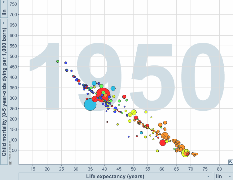
1. Infant mortality fell and life expectancy has increased significantly over the world.
Vertical - infant mortality to 5 years 1,000 people across - the average life expectancy.
The colors indicate regions of circles, and the size - population. Red - East Asia, yellow - South America, orange - Europe and Central Asia, green - Middle East and North America, blue - is South Asia, blue - Africa.
2. The risk of dying young has declined from 14% in 1970 to 5% in 2010.
The chances of dying before 50 years have been about 28% in 1970 and now half
risk of death according to age in 1970 and in 2010:
3. Infant mortality up to 5 years from 1960 significantly decreased
This graph showed in his speech, Bill Gates - to demonstrate how the vaccine changed the world.
The infant mortality rate (up to 5 years) per year in Africa, millions of children:
4. Vaccines significantly reduced mortality and disability from diseases
Comparison: how many percent decreased cases of fatal diseases in the United States. Compared era "to vaccines" and the current state of affairs
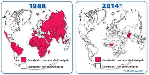
5. Vaccines have helped to advance in the fight against polio worldwide
The picture shows a red country, who could not fight polio in 1988, and in 2014 th Years:
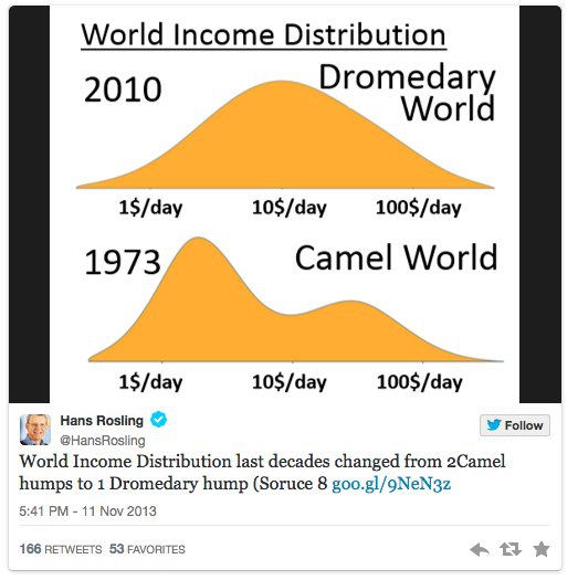
6. In general, life becomes better.
All smaller percentage of people living on $ 1 a day or less
, this graph shows that the distribution of income in the world has become more uniform (if we compare 1970 and 2010 th years), and the number of extremely poor people decreased markedly.
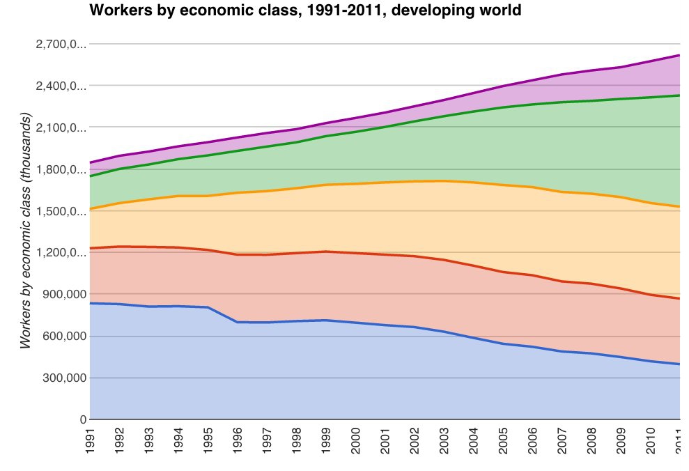
7. The middle class is expanding around the world
This graph shows how the composition of the social classes of income in the world. From top to bottom as shown increased membership class (distributed to reduce income: above average (purple), batting average (green), below average (yellow), poor (red) and extremely poor (blue).
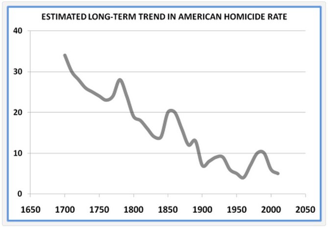
8. The number of homicides in the world and has been steadily declining
The number of murders per 100,000 inhabitants per year in different countries of the world in the last millennium (note - the vertical scale is in exponential form).
In the future, is expected to continue to reduce violence. This graph shows the trend of reducing the number of murders in the United States alone (the number of murders per 100 thousand people per year): Now in the United States 100 000 people are killed on average 4.7 people per year. For comparison, in Russia this figure: 9.2.
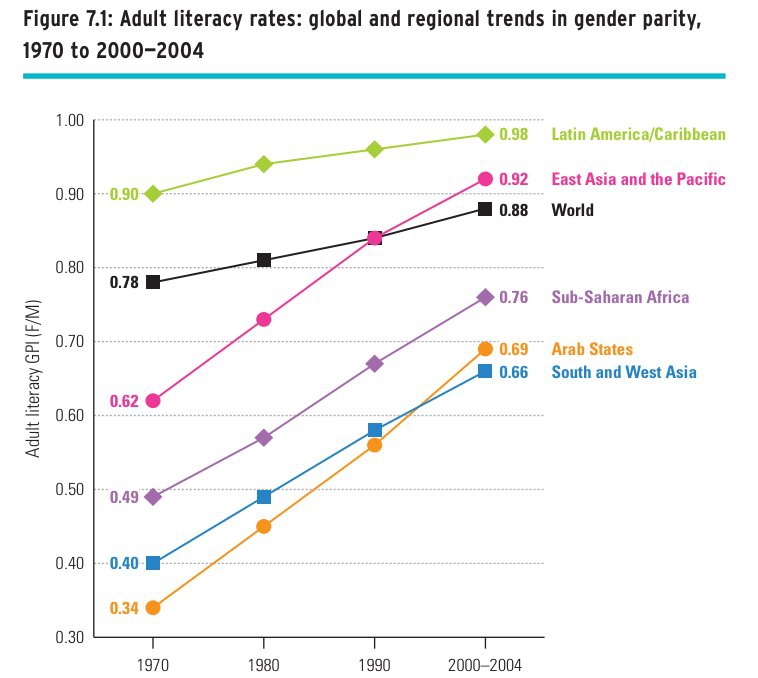
9. The literacy rate has increased significantly over the world
Graph. The growth of the literacy rate (1 = 100%) of the adult population in different regions of the world:
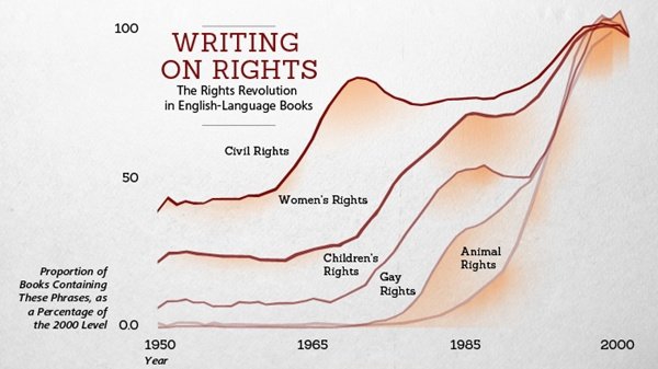
10. The struggle for the rights and the use of the word «rights» has increased markedly
On this interesting chart shows what proportion of English-language literature used the phrase civil rights (civil rights), women's rights (women's rights), children's rights (the rights of children), gay rights (gay rights), animal rights (animal rights).
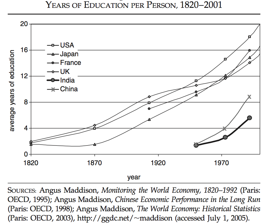
11. The average number of years spent for education is growing around the world
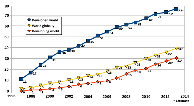
12. Percentage of people with access to the Internet has grown steadily
Blue on the chart shows the percentage of people with access to the Internet in developed countries, yellow - the world average, red - in developing countries.
Like the post? Support Chips, click:
Tags: world , graph , life
Source: www.businessinsider.com


 Post time 19-2-2015 10:47 AM
 See
See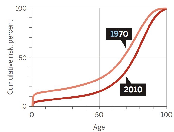


 变色卡
变色卡


![[Edisi Tahniah] Selamat Pengantin Baru Fikhry Ibrahim](https://uf.cari.com.my/forumx/mforum/block/84/841c56053d70be4814b8e8b5697437aa.jpg)